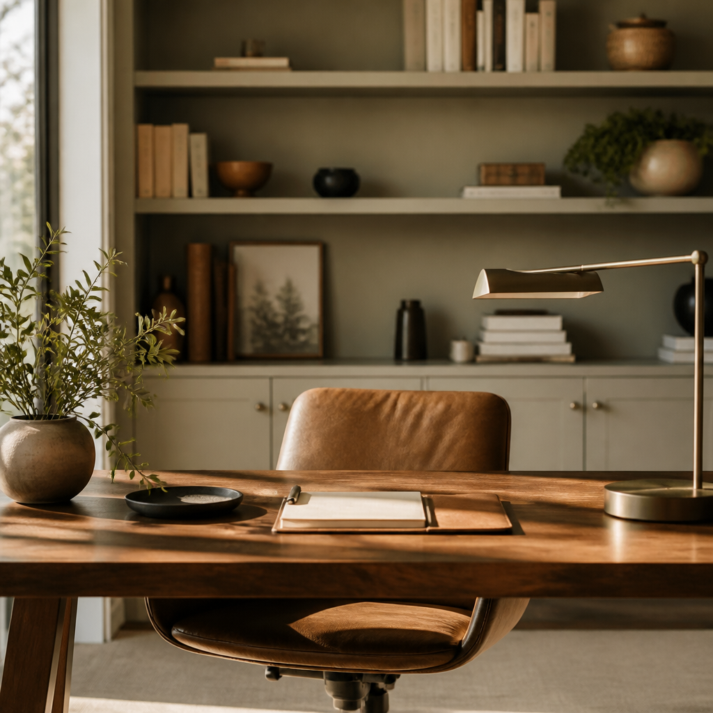
A home office should be designed like a work environment, not like a spare room that happens to contain a desk. The biggest gains usually come from better desk placement, glare control, chair comfort, and storage that keeps the work surface clear enough to think.
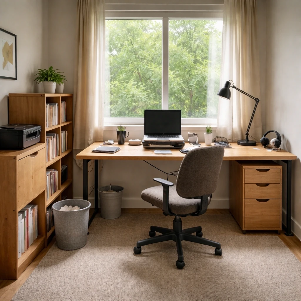
Start with how the room is actually used. A call-heavy office, a deep-focus writing room, and a two-monitor technical setup all need different answers. The best office layouts are built around the type of work being done there, not around a generic picture of what a stylish workspace is supposed to look like.
Ergonomics still matter because the room has to support hours of use without strain. Once the desk, screen, chair, and task light are working properly, the space gets easier to refine. Good offices feel calmer and more capable at the same time, which is exactly what keeps them from turning back into storage rooms or half-used corners.
Start with the room itself
A planning-focused home office guide has to begin with the body because long working hours magnify small errors into chronic irritation. Neck extension, wrist compression, screen glare, poor chair fit, and acoustic distraction are not vague annoyances; they are design failures that accumulate through repetition. The reason office planning often produces such high return is that many of the fixes are measurable. Desk height, monitor distance, eye line, light level, and reach range can all be improved with more objectivity than most rooms allow.
The room also has to reflect the type of work being done there. Deep writing, technical dual-monitor work, teaching on video, paperwork, and client calls ask for different backgrounds, surface areas, storage patterns, and acoustic conditions. A compact wall desk may be enough for laptop administration and completely inadequate for document-heavy or screen-intensive work. Planning well means naming the actual tasks, the hours spent on them, and the physical tools they require before the room starts being styled as a generic symbol of productivity.
Light deserves special attention because bad office lighting quietly undermines concentration. Daylight direction, screen orientation, and the amount of lux on both the work surface and the face during calls all matter. A home office often needs a more deliberate mix of ambient and task light than people expect, especially if it doubles as a guest room or spare bedroom. Video backgrounds complicate this further; the room needs to support not just seeing the work, but being seen professionally while doing it. A beautiful office that produces tired eyes and muddy call lighting is still underdesigned.
How to plan it cleanly
Measure the footprint and the working clearances
Account for wall width, chair travel, storage depth, door swings, and daylight direction before choosing the desk. An office that looks fine on paper can still fail if the chair cannot roll back cleanly or the door clips the file cabinet every morning.
Define the actual work pattern, not the aspirational one
Deep-focus writing, dual-monitor technical work, teaching on calls, and paperwork-heavy administration all require different surface area, background control, and storage logic. Write down the top daily tasks and let those tasks decide whether the room needs more desk, more shelving, or more acoustic separation.
Set ergonomic baselines before styling the room
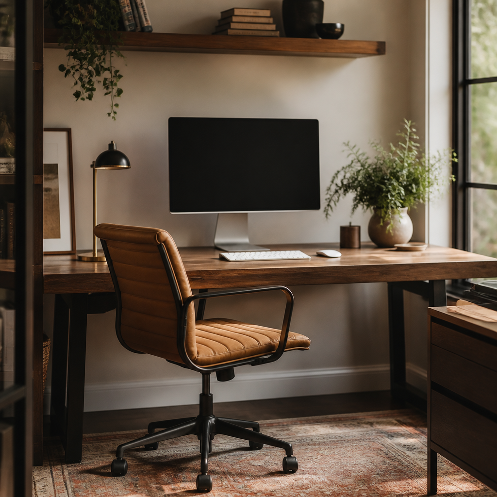
Place the screen so the top sits at or slightly below eye level, keep keyboard height and chair adjustment close enough to preserve roughly 90-degree elbow posture, and make sure feet are supported on the floor or a footrest. These fundamentals prevent the slow accumulation of shoulder, wrist, and neck strain that people often misread as just part of work.
Orient the desk to daylight, glare, and background
The desk should take advantage of natural light without facing a blinding window or putting hard reflections on the screen. Also check what appears behind you on calls; a calm background and good facial light usually matter more than decorative styling flourishes that clutter the frame.
Layer task light and acoustic control intentionally
Overhead light alone rarely gives enough precision or comfort for long work sessions. Add task lighting at the desk, aim for enough illumination on the work plane and the face, and use rugs, curtains, bookcases, or dedicated acoustic treatment where echo or speech bleed is a problem. A quieter office is often a more productive office even before any furniture is replaced.
Store by frequency and protect the primary surface
Keep daily tools within immediate reach, weekly-use items within swivel distance, and archives farther away or behind doors. The desktop should not become permanent storage just because the room lacked a plan. Good office storage reduces repeated micro-effort, which is one of the fastest ways to make the room feel more professional and less draining.
What makes the room fail in practice
Storage should be planned by frequency of use rather than by volume alone. Daily tools belong within easy reach, reference materials just beyond that, and archive material farther away or closed off entirely. Visual noise is not a moral problem, but it is a cognitive one; clutter increases decision friction and makes focus harder than it needs to be. Because of that, office design often improves more through better adjacency and concealed storage than through any decorative adjustment. The room should support concentration by removing small bits of repeated effort, not by demanding constant maintenance to look tidy.
A good office guide should therefore teach planning in layers: task analysis first, ergonomic fit second, daylight and artificial light third, storage and acoustic control fourth, and only then aesthetic refinement. That sequence distinguishes a broader office inspiration page from a true setup guide. The result should be a room that supports concentration, call clarity, and physical comfort over many hours, not just a room that proves a desk was purchased.