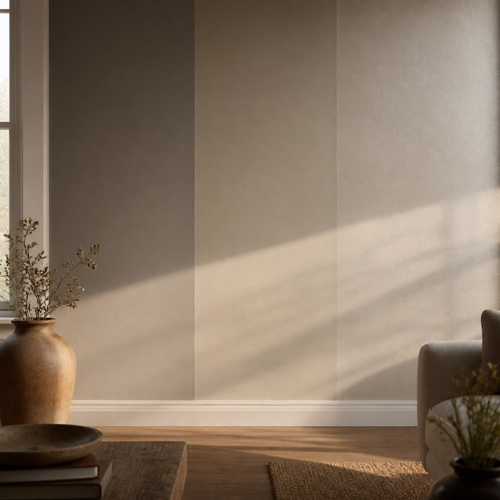
Paint is one of the most impactful and affordable ways to transform a room, but the wrong color can make a space feel completely off. The single most important step is testing samples on your actual walls—never choose from a chip alone. Paint colors look dramatically different in your space than on a store sample due to lighting, surrounding colors, and the natural variation in paint sheen. Apply samples to at least two walls and observe them throughout the day, from morning light through evening artificial lighting.
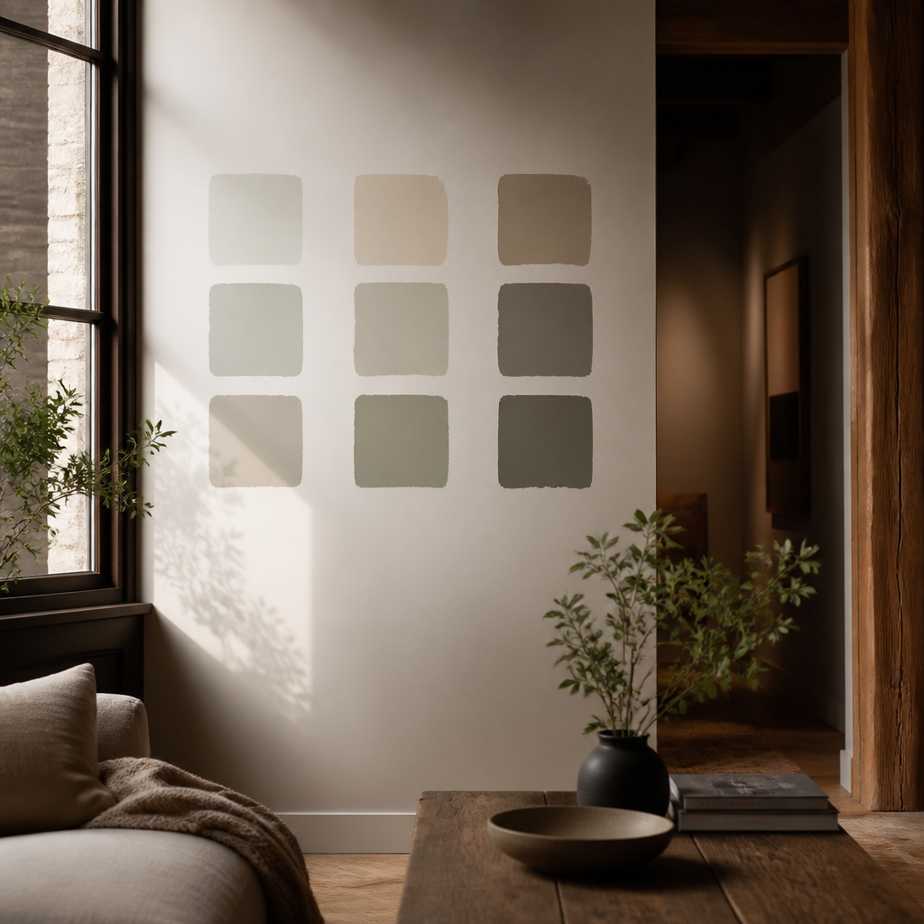
Understanding undertones is crucial for avoiding costly mistakes. Many grays have blue, green, or purple undertones that become obvious only after painting. Beiges can lean warm (yellow/orange) or cool (pink/green). The simplest approach is to bring large paint samples home and compare them against your fixed elements: flooring, countertops, and any wood trim. If you're overwhelmed, start with warm whites if your space lacks sunlight, or cool whites if you have abundant natural light. Benjamin Moore and Sherwin-Williams both offer excellent neutrals that work across most lighting conditions.
Once you've narrowed to two or three colors, buy small sample pots and paint large patches (at least 2 feet square) on multiple walls. Live with them for 3-5 days before deciding. Consider the room's purpose: bedrooms benefit from calming, slightly darker tones for better sleep, while living spaces often work well with lighter hues that reflect more light. Remember that matte finishes hide wall imperfections better than eggshell or satin, and that paint dries darker than it looks wet.
The rules that matter
Paint decisions become clearer when they are tied to room conditions instead of abstract color preference. Daylight direction, undertones in fixed finishes, sheen, and evening lighting all change how a wall color behaves at full scale.
This guide is built around that grounded process: reading the room first, narrowing colors by undertone, and testing them honestly before committing. Paint failures usually come from skipping those steps rather than from choosing the wrong broad color family.
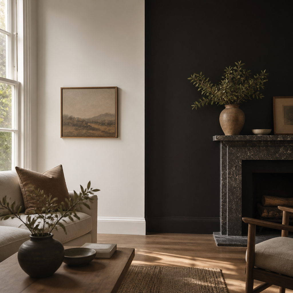
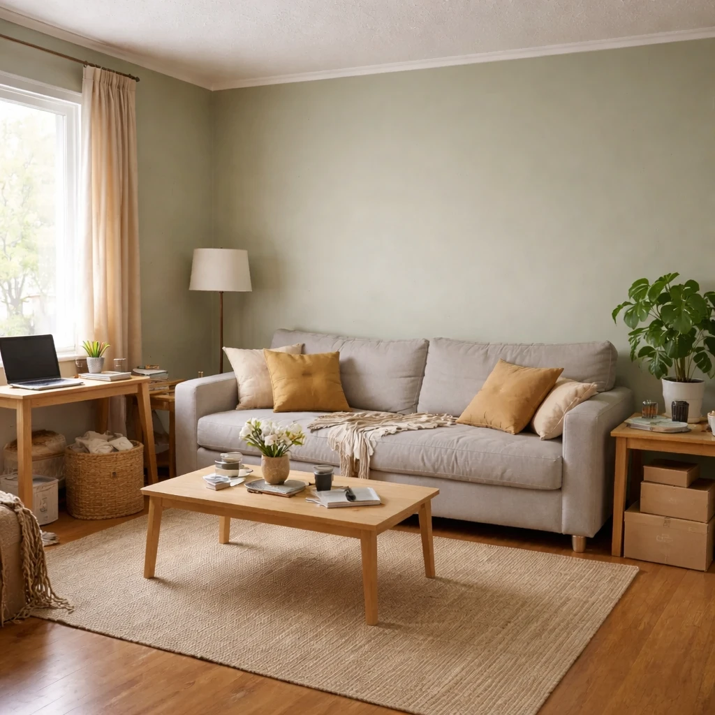
The practical payoff is significant. A good wall color can correct darkness, soften contrast, unify mismatched materials, or make a room feel taller and calmer. A bad one can exaggerate every problem the room already had.
How to work through the decision
Read the room's daylight direction first
Note whether the room runs cool, warm, flat, or dramatic through the day. That behavior is the first filter for any paint shortlist.
Match the color to the fixed materials
Flooring, tile, counters, and large upholstery pieces create undertones the paint has to live beside, not override.
Shortlist by undertone, not just by color family
Warm whites, cool grays, creamy beiges, and muted greens can look extremely different once spread across a wall. Narrow the options by undertone early.
Choose sheen for both look and wear
The same color will feel different in matte, eggshell, or satin, and the room's traffic and moisture levels should guide that choice.
Sample large patches in more than one spot
Paint test areas near the window and in the darkest corner so you see the color under the room's full range of conditions.
Commit only after seeing the room at night
A paint color is not truly chosen until it has been judged under the lamps and evening light the room will actually live with.
Where people usually get it wrong
That is why paint should be treated as a room-behavior decision as much as a decorative one. The color has to live with the room's light, not just flatter a sample chip.